Do you know that over 60% of web traffic now comes from mobile devices? And this number is only growing, which means that if your website isn’t optimized for mobile, you’re missing out on an extensive chunk of your potential audience.
Writing mobile-friendly content is essential to stay ahead of the competition and ensure that as many people see your website as possible.
There are different types of mobile apps present in the market and it is important to choose mobile-friendly content for a better user experience.
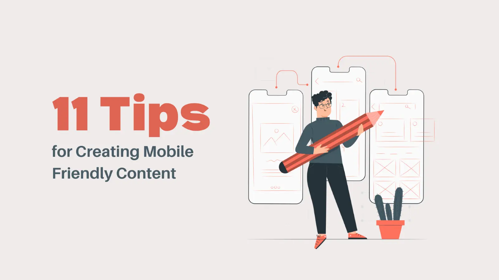
In this article, you’ll learn 11 tips for creating mobile-friendly content that will help you reach a wider audience and keep them engaged.
What Does Mobile-friendly Mean?
Mobile-friendly content can be easily accessed and read on a mobile device. It includes text, images, videos, and any other type of media.
You must remember that not all mobile devices are the same. Some have small screens while others have larger ones. And some people may be using their mobile devices in portrait mode while others are in landscape mode.
That’s why it’s essential to design your content in a way that can be easily viewed, no matter what device someone is using.
How Important Is Mobile-friendly Content?
As we mentioned before, over 60% of web traffic now comes from mobile devices. This number continuously grows as more and more people use their smartphones and tablets to access the internet.
One study found that 61% of people are unlikely to return to a website that isn’t mobile-friendly. And another study found that 79% of people will visit a competitor’s website if the one they’re trying to visit isn’t working well on their mobile device.
It only shows the importance of having mobile-friendly content. If you don’t have it, you’re likely to lose a lot of potential customers or website visitors.
What are the benefits of mobile-friendly content?
There are many benefits of having mobile-friendly content on your website.
Some of the most notable benefits include:
1. Reach a wider audience
As we mentioned before, more and more people are using their mobile devices to access the internet, which means that if your website doesn’t have a mobile-friendly design, you’re missing out on a large portion of your potential audience.
2. You’ll improve your SEO
Google has stated that they’re now using mobile-friendliness as a ranking factor in their search algorithm. If you optimize your website for mobile, you’re more likely to appear in search results. And we all know how important it is to rank high in Google search results.
3. You’ll improve your website’s usability.
If your website is difficult to use on a mobile device, people will likely give up and go to a competitor’s site. But if your website is easy to use and navigate on a mobile device, you’ll keep users engaged and more likely to convert into customers or leads.
4. You’ll stay ahead of the competition.
Optimizing your website for mobile is necessary to stay ahead of the game. This way, you’ll be ahead of the curve and can attract more website visitors and potential customers.
5. Creating A Mobile Friendly Content
To help amplify your mobile content efforts and ensure a better user experience, follow these tips for creating mobile-friendly content.
6. Keep it brief and to the point.
When writing mobile-friendly content, it’s important to keep your text short and to the point. It can be challenging if you’re used to writing long-form content, but it’s important to remember that people have shorter attention spans when reading on their mobile devices.
7. Create content in chunks
For easy reading, break your content up into smaller paragraphs with headlines. Mobile users are more likely to skim through your content, so making it easy for them to find the information they’re looking for is important.
Short and snappy content is more likely to be read and shared than long-winded content. In practice, chunking is about creating content in smaller paragraphs with headlines. It will make your content more scannable for mobile users who are likely to skim through your content.
To chunk your content structure for reading on desktop computers and mobile-friendly pages, you can choose to use:
- Bulleted lists
- Short paragraphs
- Subheadings
- Images
8. Keep your title short and descriptive.
Your title should be short, accurate, and to the point. Keeping your title under 60 characters is a good practice. Each paragraph should target a specific keyword or phrase, and your title should accurately reflect the topic of your article.
You can work out the below-listed points:
- Use clear and on-point headlines
- Keep your headlines under 60 characters
- Use numbers and lists in your headlines
- Use powerful words in your headlines
9. Use easy-to-read font sizes.
When creating mobile-friendly content, it’s essential to use easy-to-read font size to make your content more legible on a small screen. It’s highly recommendable to use a font size of at least 16px.
10. Maximize white spaces.
It’s also a good practice to maximize white space as much as possible to make your content more legible and easier to read on a small screen. White space also helps break up your content, so it’s easier to scan.
11. Use short and simple sentences.
Another trick is to use short and simple sentences because they’re easier to read on a small screen. It can be challenging if you’re used to writing long-form content, but it’s important to remember that people have shorter attention spans when reading on their mobile devices.
12. Use large and easy-to-click buttons.
Also, remember to use large and easy-to-click buttons to make it easier for people to click on your links and call-to-action buttons when using a small screen.
Mobile users are more likely to click on a button that’s easy to see and click. So, using buttons that are large enough and spaced out appropriately is the way to go.
13. Use images wisely
Images are an excellent tool to break up your content and make it more visually appealing. However, you need to use them wisely. When creating mobile-friendly content, it’s essential to use relevant images with small file sizes to load your content faster on a mobile device.
14. Optimize your content for voice search
With the rise of virtual assistants, optimizing your content for voice search is important. To optimize your content for voice search, you need to use natural language (or long-tail keywords) people use when speaking on a device.
It’ll help your content rank higher in search results when people use a virtual assistant.
15. Use AMP pages for faster loading times.
AMP pages are designed for faster loading times on mobile devices. If you have a lot of images or videos in your content, you may want to consider using an AMP page to ensure that your content loads quickly on a mobile device.
16. Use Google’s Mobile-Friendly Test tool.
A Mobile-Friendly Test tool from Google allows you to check the mobile-friendliness of your website and determine its mobile optimization.
Final Thoughts
When creating mobile-friendly content, it’s important to keep these practical tips and tricks. By following these, you’ll be well on your way to creating content that’s optimized for mobile devices.