In the ever-continuing eCommerce race, it’s vital to have a well-performing, findable, and appealing site. With so much competition on the market, your online business won’t go far if it doesn’t live up to the expectations of users and search engines alike. The demands are growing, and people crave fast omnichannel solutions and user-friendly sites. Otherwise, stores see a loss in conversions, increased bounce, and disappointing cart abandonment rates.
On this page, we’d like to give you five tweaks for page elements and optimization ideas that you can consider adding (or upgrading) on your online retail site to pick up your sales. For some inspiration, we’ll share examples of such functionality and elements used on the websites of renowned brands. Let’s roll!
1. Enhance Your Product Categories
You can do so many things to the website of your online store to improve its sales. For starters, you can optimize its speed, rethink your UX and UI, improve your product checkout, image loading speed and even invest in building a progressive web application for your store to lift up the conversions made from mobile devices.
As such, your online store’s product categories certainly deserve attention. Properly broken down categories are already a great part of the deal. Here are some recommendations:
- Try to make it simple for people to find your products and avoid too complex hierarchies if possible. Ideally, any product should be reachable from the top menu in three (maximum four) clicks. Otherwise, it’ll be difficult for users to find.
- What’s for the category page itself, even if you have many products per category, don’t pile them all up together. Three to four products per row is more than enough; each should have enough space, short but all the necessary data, and large images. If you have a grid that’s too packed with products, you’ll lose the user’s attention.
- Furthermore, the convenience of filters is also essential. Make it easy for your buyers to narrow down their search on the website and find what they need. So, apart from thinking through how useful the filters are (remove all excessive or unneeded ones, and add those that matter), if you are an SEO or Digital Marketer then you know it’s wise to rationalize the elements that make up your filters (checkboxes, droplists, radio buttons, etc.). It should be fast and simple to filter things.
- Plus, consider spicing up the page by incorporating various banners of special offers or new arrivals in place of this or that product within the grid. This is another great way to lift up your eCommerce store’s conversions.
You can see an example of this on the screenshot below taken from an Adidas category page. Did you notice that this discount offer is also clearly stated in the heading of the page?
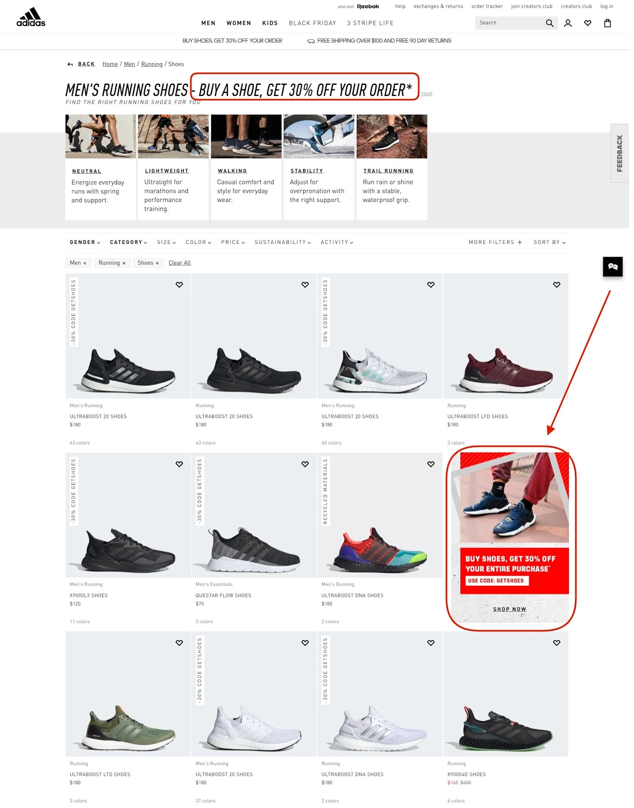
Screenshot was taken on the official Adidas website
2. Add a Gift Section to Boost Sales of Your eCommerce Store
Another outstanding tactic for growing online sales is providing a “Gifts” block. Most people get headaches when they face the necessity to shop for gifts for someone else. No matter who the recipient is, we usually want to get them something nice, not just a soulless gift card.
After all, finding presents is often very tricky. Thus, by giving your customers a hand, you can build relationships with your clients and surely increase your revenues.
- As a rule, such collections of presents are created based on budget, recipient, occasion, etc., and are put together as separate pages.
- Following that, it is considered good practice to place gift sections right within the website’s main navigation menu.
Take a look at the screenshot of the top menu of the Gucci website. The “Gifts” tab is carefully present among the first level of the menu. There are gift categories for men, women, and kids. Plus, there’s information related to the company’s other gift services on the right side of the section.

Screenshot taken on the official Gucci website
To top that, you can have a section devoted to “Personalized Gifts”. Numerous online stores invest in product customization functionality. This way, they allow their customers to assemble a unique look of the product, changing some parts to their liking.
Such product builders can be of great hand to personalize products, including for gifts, and to consequently grow orders. In the case of Gucci, the site provides the chance to indicate initials on select clothing items, accessories, and bags. Below is an example of such a “Make It Unique” block on the Coccinelle website.
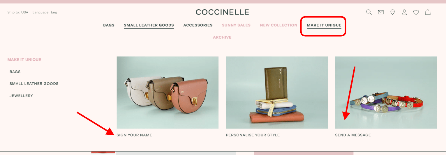
Screenshot taken on the official Coccinelle website
3. Link Up Social Media Content to Grow eCommerce Orders
Proper social media advertising can surely help boost eCommerce sales and the store’s traffic. Here are some specific tips for enterpreneurs.
- A not too obvious but effective tactic for growing sales of an online store is adding a widget that pulls user-generated social media posts to product pages. The thing is that this “move” brings many benefits. One of them is inspiring shoppers to get the item by showing how other regular people use the product.
- Secondly, this certainly grows trust in your online store. When potential buyers see the product “in action”, this subconsciously gives them more confidence and ground to buy from you.
- Thirdly, both your brand gets more visibility across social media (via the personal accounts of your customers) and your clients get the attention they’re craving (as many people can see their posts on your website). This raises customer satisfaction! Reposting such content in your site’s social accounts is smart too.
For instance, below is a screenshot from a product page on the NYX Cosmetics website. This widget displays social media posts with the tagged product and your account. When clicking on an image from this slider, it opens in a pop-up, gives credit to the user, and shows shoppable products that were used when creating the “look” that’s on the photo.
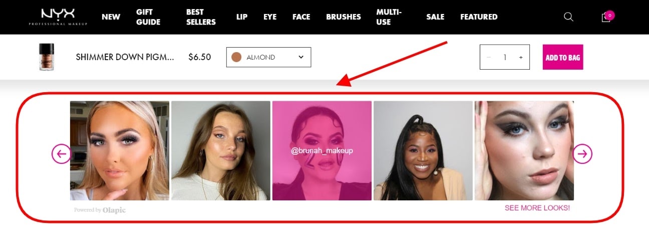
Screenshot taken on the official NYX Cosmetics website
4. Make Use of Upselling Blocks to Enhance eCommerce Sales
The fourth thing you should consider doing to raise your online store’s conversions is enhancing your cross-selling blocks. If you don’t have them, get them. Keep this in mind:
- The chances that your prospect will spend a long time matching things from the same product line or just those items that go well by themselves aren’t large.
- So, as a digital marketer or online business owner, you should take care of this point for them. Say, you sell clothing, suggest accessories, shoes, or tops that’ll be a nice fit with the currently browsed jeans. This is a nice personalization move too!
- If implemented correctly, this digital marketing strategy can help increase the cart size and average orders with such an upselling element.
Case in point, the product pages on the official Hugo Boss website have such “Hugo Boss Recommends” sections. Each of them differs from page to page, pitching only those items that’ll really work well together. This section, essentially, plays the role of a silent shopping assistant that gives your buyers hints.
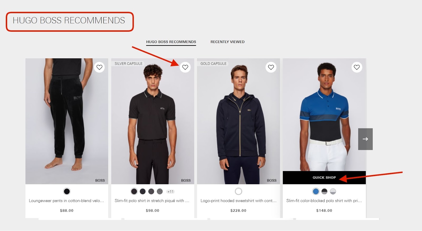
Screenshot taken on the official Hugo Boss website
5. Don’t Overlook Product Reviews
The fifth website element that we’d like to cover among the things to tweak on your online store for enlarging your sales is customer feedback. This type of user-generated content is a real goldmine for online businesses.
Did you know that, as a rule, prospect buyers refer to other buyers’ opinions before making up their mind to spend money on something or not? Consider this stat if you don’t think that feedback matters. According to the data provided by Boast:
“88% of consumers say reviews influence their online purchasing decisions.”
People are much likelier to believe what other buyers just like them have to say about the ups and downs of something than whatever you might promise in product descriptions. This is exactly the reason why every product page must be fitted with a handy feedback block.
Let’s go over a pretty neat example of the “Ratings & Reviews” on a product page on the official Maybelline New York website.
- The section is “opened” by the “Rating Snapshot” which basically summarizes all the opinions people have about the item.
- Importantly, there’s a clear call to action button, “Write a Review”, that invites others to share their point of view.
- Finally, each independent review displays short information about the person who left the testimonial, including their age and other features.
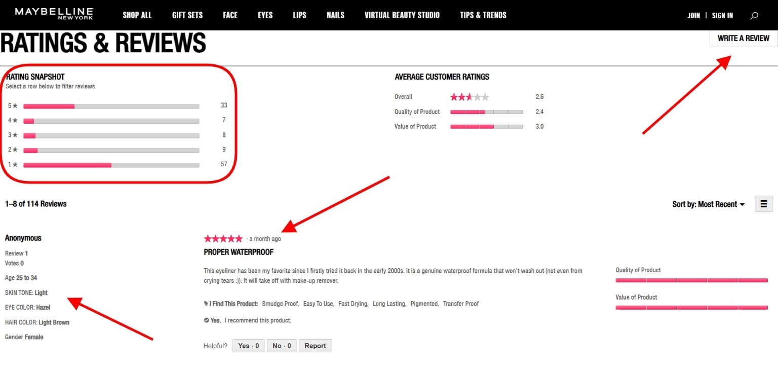
Screenshot taken on the official Maybelline New York website
6. Keep Budget for Web security
Web security is an essential part of any online store, and if it does lack proper security, then there will be a hard time for web traffic. An SSL certificate could be an ideal answer for web security. Either you stick with a single domain or wildcard SSL like Comodo PositiveSSL wildcard is a cost-effective certificate. You will have higher customer assurance along with high traffic on your website.
Final Word
Concluding everything covered in the article, no online store will be compatible if it doesn’t change in step with the clients’ needs. People want to see a nice design and well-presented products. They want to shop in online stores that are easy to navigate and that work quickly regardless of the used device.
There’s much that can be done to help your eCommerce site sell more and bring back better earnings. Pay special attention to the site’s performance, speed, visual appeal, and mobile-friendliness. As for the specific parts to tweak on the website, give your product checkout extra thought, and consider working on the five points covered in this article!


